As we delve further into the era of big data, the practice of using data to inform decision-making practices is being prioritized across businesses. Analyzing data, finding patterns, and generating inferences are critical foundational data literacy skills. But what happens after the data has been crunched, the options have been evaluated, and the analyses have been created? How do teams ensure that the analyses move past the page and into action?
Handing off a data-driven business analysis is like giving a friend a gift. You spent time researching their interests and proved to yourself that this gift would hugely impact their life. You put the gift nicely in a box, wrapped it carefully, and sent it off for delivery. However, when they open the present, they are unsure what it is or why they want to use it. There is a long instruction manual included. Do they read it? Or do they put it aside?
The best data-driven analysis delivered to the smartest stakeholder falls short when not communicated effectively and presented properly. Therefore, teams must transition from data analytics experts to data analytics educators.
"More than half of Americans rely on their 'gut' to decide what to believe, even when they are confronted with evidence that speaks to the contrary."
Having spent years working on engineering teams, I would constantly see my colleagues devote the time to pull together thoughtful analyses but then fail to present their stories. In my career, I prioritized developing my presentation skills and quickly found myself leading these teams because of that. So often teams forget the important last step: data storytelling. Learning how to present the story of your analysis, rather than passing it off to stakeholders as a finished product without any guidance, will not only educate them on what your finding is but why they should act.
The following framework can help you harness your inner educator, create buy-in from business leaders, and develop a collaborative data-driven business through effective data storytelling.
# 6 Steps to Harness Your Inner Educator and Communicate Data Effectively
# 1 | Identify the Takeaway
Often when you have worked extensively on an analysis, it is easy to lose sight of the big picture. So, instead, step out of the weeds and focus on the key takeaway.
In Action:
- Ask yourself, what is it that you want your stakeholders to leave understanding?
- Identify the call to action and decision points.
# 2 | Storyboard Your Message
Data software helps us see what is happening but does not tell us why. Even the most data-savvy stakeholders will lack the inspiration to call for change if there is no story to follow. Data storytelling ensures critical information is effectively conveyed, fully understood, and remembered by key stakeholders.
In Action:
- Write out each chronological step of your work.
- Evaluate classic story arcs to shape the story your analysis is telling.
- Practice presenting data to a colleague. What questions are they left wondering about?

# 3 | Trim the Content
An analysis that leads to significant business decisions may take months of work, but the time in front of the final decision makers? Minutes. Stakeholders do not need to see each misstep, every piece of supporting detail, or all the iterations of an analysis. Instead, only include content that is crucial to the final message in your data presentations.
In Action:
- Document the details. Although unnecessary to present, they will help recall the analysis, answer follow-up questions, and onboard new team members.
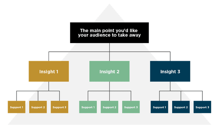
- Create a Minto Pyramid to ensure the content is concise and in line with the key takeaway.

# 4 | Highlight the Unusual
Depending on the stakeholders' familiarity with the work, a good portion of the analysis is likely expected. Disrupt the presentation by calling out what is different, new, or unexpected. Highlight uncertainty and risk.
In Action:
- Develop a slide that focuses on the risk associated with potential decisions. Then, quantify the impact and certainty.
- Stop sharing your presentation to highlight a key discussion point. The disruption in the visual will pull stakeholders' attention into focus.
# 5 | Make it Tangible
According to a 2004 National Library of Medicine study, an estimated 65% of the population are visual learners. Therefore, showing stakeholders how you worked through an analysis generates a more substantial impact than just telling. When communicating a data analysis, help the stakeholder ground their understanding of the work by making it tangible.
In Action:
- Visually show the data that has been generated.
- Use drill-down features of interactive dashboards to walk stakeholders through the work.
- Share an analogy that supports the key takeaway.

# 6 | Practice
The well-known psychological study by Dr. Albert Mehrabian exposed that only 7% of a presentation's effectiveness is content, meaning body language and vocality require care and dedication to ensure your work reaches its full potential. Therefore, before taking your well-prepared presentation to the stakeholders, take the time to practice.
In Action:
- Say it out loud. Identify words you stumble over and acronyms that need to be spelled out.
- Create a simple outline of section headers, key points, and transitions.
- Practice in front of a mirror to assess body language and gestures.
# In Summary
As advanced as our abilities to create meaning from data have become, our abilities to tell the data's story must also advance. Teams who pass off analyses without taking the time to educate their stakeholders from beginning to end will fall short of supporting a data-driven business. Using this framework to harness your inner educator ensures that a company fully grasps critical work and transforms it into action.


